Subscribe to:
Post Comments (Atom)
skip to main |
skip to sidebar
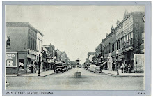
Linton of Yesteryear - Main Street

The City of Linton has been referred to as the ‘Magic Coal City’ or even the 'Pittsburg of the West’ because of its vast coal reserves. Coal mining in the early-1900's made this area thrive. Then, the mines went away. Yet, this small city still remains. Today, coal mining is making a resurgence again after many years without. Reinvigorating small business and personal financial education will help with its come back as the smallest, ‘big town’ in southwestern Indiana.
PHOTO OF THE WEEK
Linton of Yesteryear - Main Street
ABOUT THIS BLOG:
The primary focus is economic, financial, real estate, & small business of local interest or perspective.
All Rights Reserved, 2007-2010
------------------------
E-mail questions, comments, & ideas to: magiccoalcity@gmail.com
------------------------
QUOTES TO LIVE BY:
"He who knows best knows how little he knows." - Thomas Jefferson
"The only man who never makes a mistake is the man who never does anything." - Theodore Roosevelt
"Get your facts first, and then you can distort them as much as you please." - Mark Twain
"Fools live to regret their words, wise men to regret their silence." - Will Henry
"Any man who is under 30, and is not a liberal, has not heart; and any man who is over 30, and is not a conservative, has no brains."- Winston Churchill
Blog Archive
-
▼
2009
(209)
-
▼
April
(27)
- Out Rest of Week
- New Considerations When Buying a New Car
- Bank Robber Appeals Conviction
- ‘Tis the Season to Start Growing
- Bear Run Mine - A 'Rumor Has It' Update
- In Search of Black Gold
- Freddie Mac Official Dead
- Indiana's Biggest Ag Industry
- The Amish – Unemployed
- Purdue Life Sciences Biz Plan Comp
- Interactive Jobs Map
- Beige Book
- The 2009 Pig Book Arrives!
- CEOs: It’s Good To Be Fired
- Once Again, The ‘Net is Changing Things
- City Council Meeting Tonight
- Why Southwestern Indiana Won’t Get Funds
- ALERT: Counterfeit Bills in Area
- WSJ: Hot Dog Sales Trending Up
- Petro Arsonist Loses Appeal
- HAVE OLD PHOTOS?
- The No-Name Circus
- BANK ROBBERY
- Some Hope in the Region?
- I Look Like You!
- Shortfalls & Blame
- Job Opportunity with State for Youth
-
▼
April
(27)
No comments:
Post a Comment